
Case Study: GrandPad
Designing an ultra-minimalist and accessible tablet

Minimalist tablet screens mimic paper,
are visible in direct sunlight,
and are limited to black and white, intentionally.
What is your ideal use for a tablet? Is it an e-reader, a pad for creating digital art, or drafting your first novel? The fact is, it may be simply collecting dust on your bookshelf. The tablet need not be a subpar hybrid of laptop and smartphone, not ideally suited for what either device does best.
It turns out, unlike the near limitless applications and features of smartphones, tablet use is very context and situation dependent. People utilize tablets primarily as e-readers, for drawing art, as digital picture albums, for playing games, or for chatting with friends and family.
There is vast UX Design potential in developing a tablet website that reflects users’ needs for a streamlined, ultra-minimalist design, especially for populations requiring greater accessibility, such as older people.
How can we create discoverable, learnable experiences for senior populations and their families, in a way that meets their needs of ease of use of new technologies?
As a design team of four, we sought to answer this question. We were tasked with recreating a website for a tablet geared toward older populations: A device that would connect the whole family, allowing for fluid, seamless interactions, while not confusing and frustrating the user. Keeping accessibility at the forefront of our minds, we began researching this product space.
Introduction
Project Overview: Redesigning Grandpad.net so that the experience of the website reflects that of using the tablet itself: an intuitive interface; an educational aspect that is seamless, welcoming, and enjoyable; and a UI that limits all distractions for an easy discovery process.
Time: A 2-week design sprint.
My Role: This was a collaborative project. I was the the lead UX Researcher, conducting user interviews and synthesizing findings to inform our prototype. I helped organizationally in our stand ups, roadmap progress, and via ensuring pre-mortem goals were met.
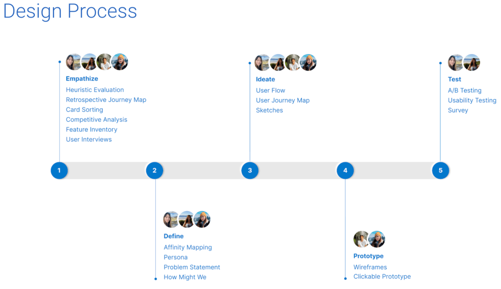
The Process: We rigorously went through the design thinking process, employing heuristic evaluations, competitive and comparable analyses, journey maps, user flows, affinity maps, several iterations of problem statements and design studio sketches and wireframes. All culminating in a high fidelity prototype.
Product Opportunities
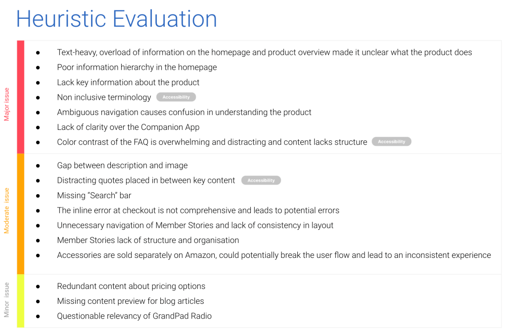
We began by conducting task analyses to evaluate the existing product. Our scenarios included: a user who cannot use a mouse needs to purchase a tablet online for their elderly relative; a user with with a cognitive disability (ADHD) needs to buy a tablet for her grandmother; a user with a visual impairment needs to learn to use a tablet from the product website.
This process provided a clear understanding of how the e-commerce site could improve UI elements, information architecture and hierarchy, to improve usability.
These tests led to a deep dive into accessibility features, designing for tablets.
See full Heuristic Evaluation here
Who are our competitors?
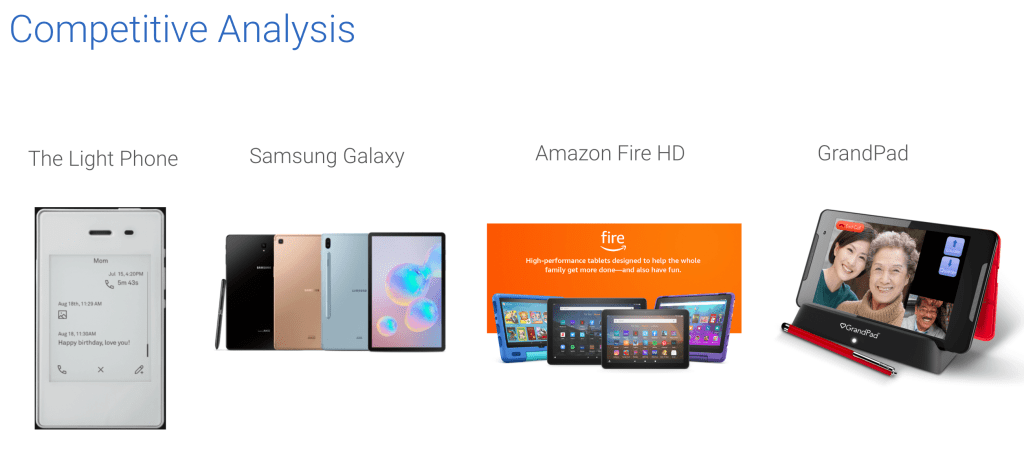
Looking at industry leaders in the personal tablet space, I selected Amazon Fire HD and Samsung Galaxy (tab S6) and did a feature inventory with these products’ websites, in addition to GrandPad’s. I also selected a phone that solves for information overload, called The Light Phone, which has a user-customizable menu of tools and limits distractions like third party apps and unnecessary features.
This feature inventory gave me a precise insight into where GrandPad falls short, compared to market leading competitors. The areas for greatest improvement were navigation and user flow, accessibility, and visual design.
Research Methods
I conducted four extensive user interviews. The interviewees fell under two groups: people over the age of 65 years old, and people with diagnosed ADHD. Our goal was to discover users’ problems, motivations and goals surrounding ease of technology use for older populations. We sought to make tablet use more accessible.
From these interviews, three personas became clear:
- An elderly person buying for themselves
- A relative buying with their parent or grandparent (Collaborative purchase decision)
- A person with a cognitive disability (ADHD/ ADD) purchasing a tablet
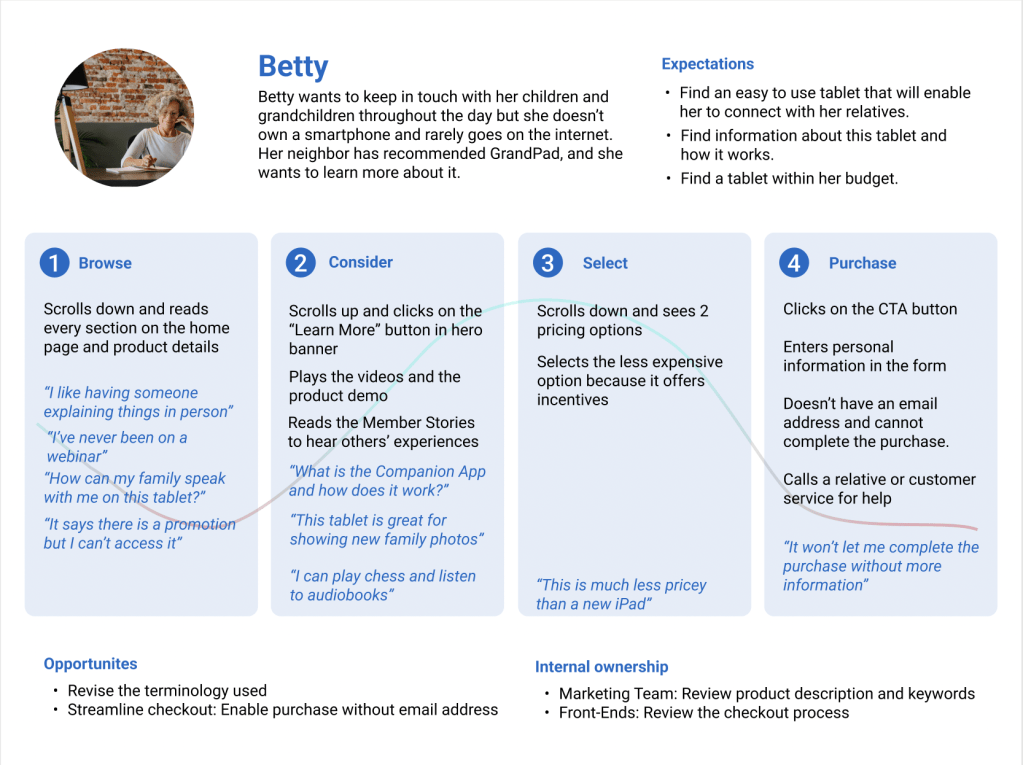
From the point of view of a persona, a retrospective user journey map demonstrated the pain points of the user experience on the tablet website.
Key Findings
My interviewees painted an indictment of our age of information, linking it to what’s been called the age of overwhelm. My research showed that people have so many complaints about their devices distracting them, to the point where they’ll ignore all notifications or not use the device.
Seniors, particularly, value comfort and familiarity in their devices; two people had purchased the same exact device again, because they were happy with it and didn’t want the hassle of learning a new phone or tablet. Older people prefer shopping in-store; their ads are from newspapers and the mail. They enjoy 1:1 instruction and guidance. Their highest priorities when purchasing tablet are: Price, convenience, minimal distractions, portable in bag/purse. People use tablets primarily as e-readers or for audiobooks. Durability is hugely important (i.e. waterproofing, longer battery life, stable set up on slippery surfaces). The main features that influenced purchase decisions were memory, sleekness (size, lightness), and camera quality.
Define (and refine) the Problem
While synthesizing our findings, we iterated many problem statements to inform our design process:
“Seniors and their families need a straightforward way to learn new technologies, so they can stay connected to each other and enjoy hobbies, all without distractions.”
So how do we best solve the problem? Our team conducted a How Might We exercise in order to look more closely at this question.

Design Studio.
Sketches
Now, for the (even more) fun part:
We began pulling everything we learned together, continually streamlining and refining designs to reach an elegant solution, one that best addresses our users’ needs, directly solves our problem statement, and incorporates our key research findings.
We sketched ideas that would improve layout and information hierarchy, so we can address the confusion GrandPad has in these regards. We gave each other feedback and critiques, and iterated.
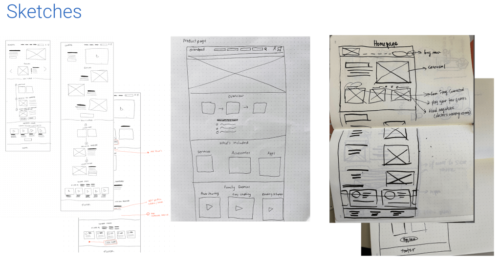
After a few low fidelity wireframes, we A/B tested core features and layout elements to gauge user preferences. Luckily, the results were statistically significant for the pricing structure and the product details pages.
After further usability testing, we started drawing out more detailed wireframes. This level of detail allowed us to hone in on the UI elements we most wanted to target.
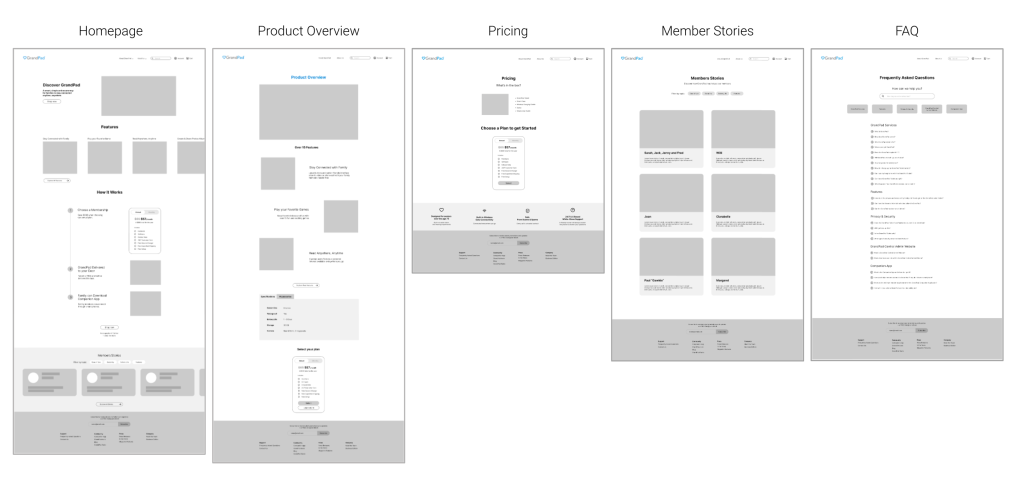
Prototype
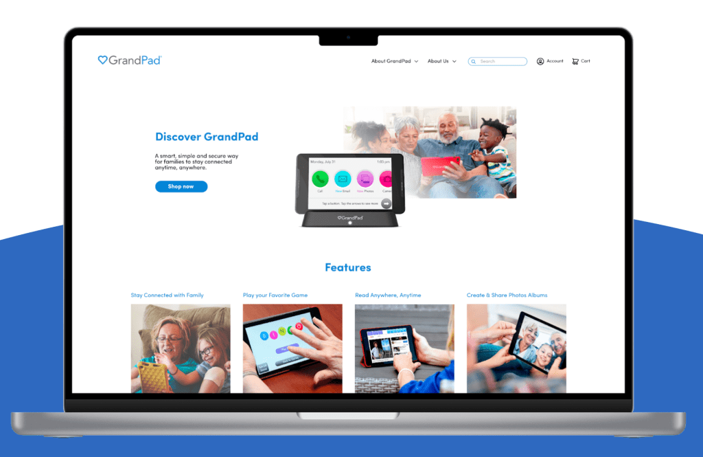
By prototyping in Figma, the new user journey is demonstrated. See a demo here.
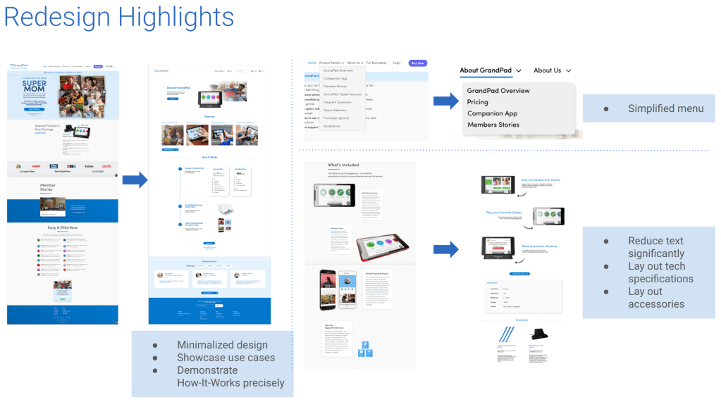
In the product overview, contrast and information architecture highlights the most in-demand features identified in our research: Connect with family, play games, read books, and create & share pictures.
We wanted to avoid users becoming overwhelmed by information quantity (over 15 features on original website) and losing their attention. Users can make a purchase decision and select the plan that best suits them, without confusion or frustration.
In each plan we improved the information hierarchy by adding more contrast to pricing, and listing all the elements included in each plan clearly.
Next Steps
Like relationships, novel writing, perfecting a macaron recipe, the UX creative design process is never truly done.
There is always a new growing edge practice to pursue, something to make our designs more impactful and deeply resonant.
Our further testing is as follows:
- Create iterations based on further usability testing
- Present the final prototype to Grandpad, and gather feedback
- Work with developers to launch site
- Gather analytics data on site performance
- Implement feedback
- and repeat
Reflection
This tablet project enabled me to empathize with our audiences in unexpected ways. Their struggles to grasp rapidly changing technologies, bloated with too many features and distractions, mirror so many of all our burdens. Our minds were not meant for this constant bombardment of bells and whistles, everything competing at max volume for our attention. What a high cognitive load this requires, just to filter out that much unnecessary information in a single day. What a drain on people’s most important pursuits, in their careers, family life and leisure time. While I painstakingly edited my interview transcriptions, I felt grateful to be able to choose my path within UX Design, toward minimalism, sustainability, and creating beauty and joy.
As a design team, we trusted each other’s expertise and let team members optimize their strengths, to great effect. We did well editing and refining each other’s work, to make things shine and stand out. Convening at stand-ups, for brainstorming, during exercises, troubleshooting and design studios proved just how agile, high quality and lightening fast the design process can be.

Top preferences
Audiences use tablets primarily as e-readers, digital photo albums, and to listen to audiobooks.

Connect
Follow me on Twitter, LinkedIn and Medium for my latest blog posts and exclusive content. Email me to chat about sustainable design or to say hi!