
Client: balance lab
Mindfulness practices that are practical and warmly personalized.
During a 3 week design sprint, my team and I built a website for a meditation teacher in NYC, to define his offerings, grow his audience, and distinguish his company.
Our goals were to help Balance Lab meet highest priority business objectives:
- Exceed competitive set, i.e. meditation apps such as Calm and Headspace
- Educate clients (potential students and HR leaders) about Balance Lab’s product offerings
- Grow student base via email collection and new enrollments
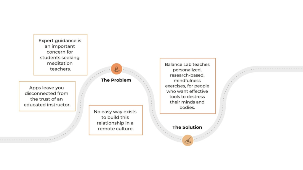
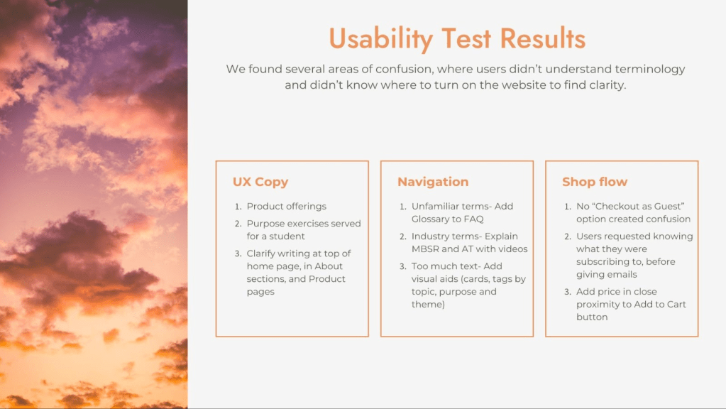
Balance Lab has created a wonderful set of mindfulness techniques, with glowing student testimonials and a warm, calming meditation teacher. Their website didn’t clearly outline what these meditation practices were, so potential students lacked clarity about their unique value.
Our client teaches Mindfulness Based Stress Reduction, which studies have found is remarkably effective. (Our MVP UX Writing capitalized on the breadth of meditation research: “Meditation backed by science, rather than fads.”)
THE CHALLENGE
Translate the human connection and quality Balance Lab offers to the web. Demystify the process of growing self-awareness, and help people find types of meditation they will love.
WHAT WE DID
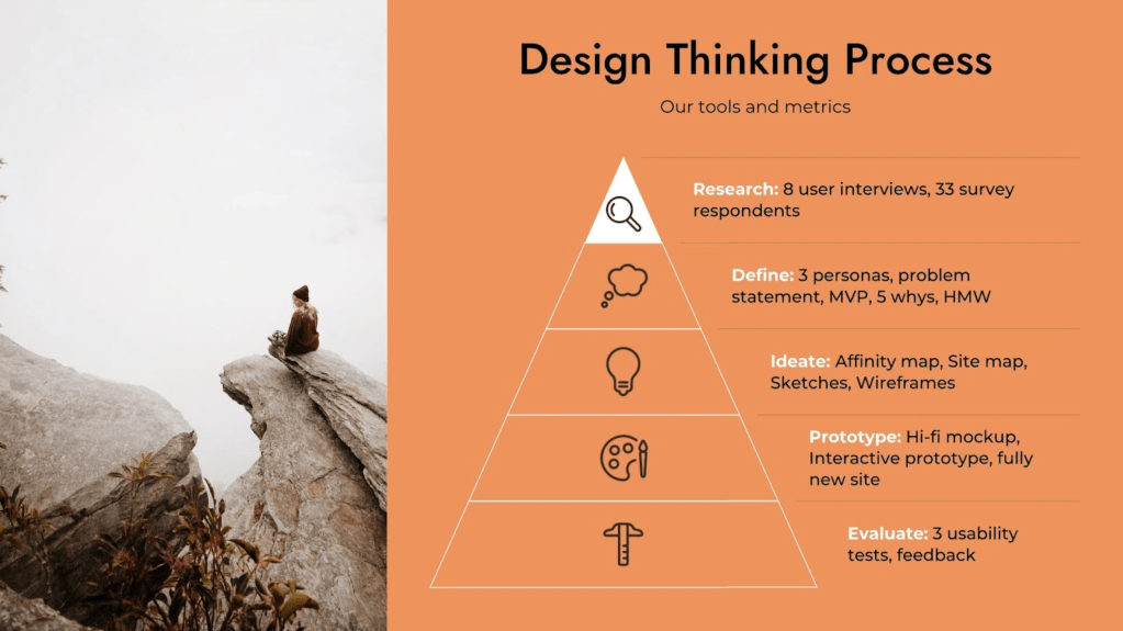
Before jumping into design work, we rigorously researched the market sector, which has rapidly grown in the past 2 years alone. We conducted a heuristic evaluation and feature inventory on the existing website. We interviewed 8 people, including current and former Balance Lab students, HR leaders, and avid meditators. We gathered 33 responses from our feedback survey.
We discovered precise goals of people who meditate and market opportunities, generated creative solutions, and tested those solutions with our high fidelity prototype. We collaborated with our client and advisor, throughout our design process and development of the website.
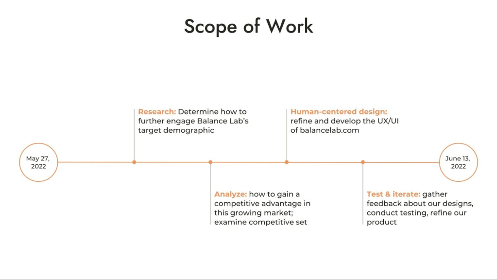
Establishing a SOW from the outset powered our roadmap forward, and delightfully with each client meeting, we were able to expand this project’s reach due to out progress: We developed a style sheet and design guide for the visual design, a pitch deck for stakeholders, a cost-benefit matrix, and a content inventory for our client.
How We Did It.
Background Research
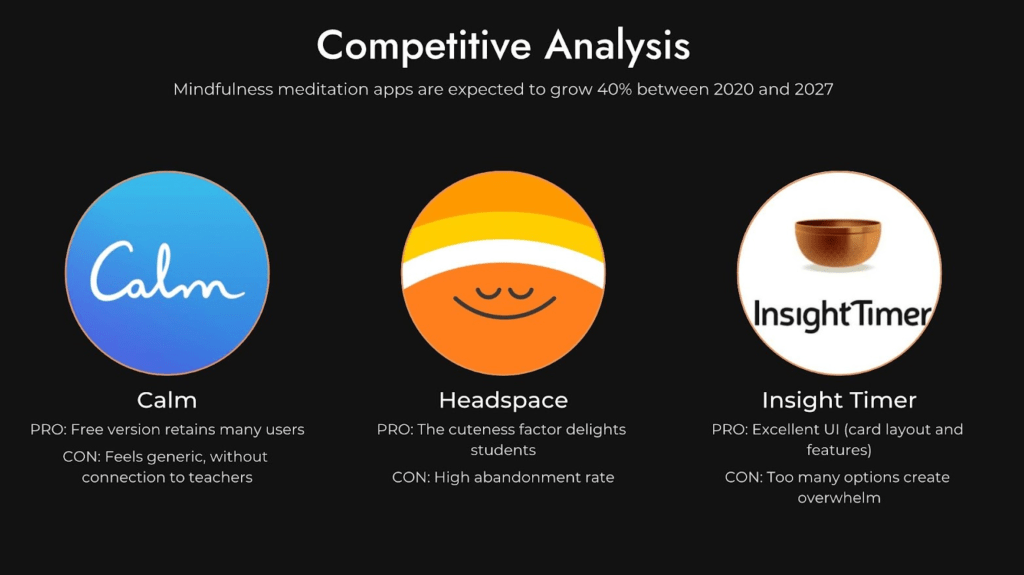
We examined the industry leaders in online meditation, and looked at the overall business space for a broader perspective.

Examine Competitors
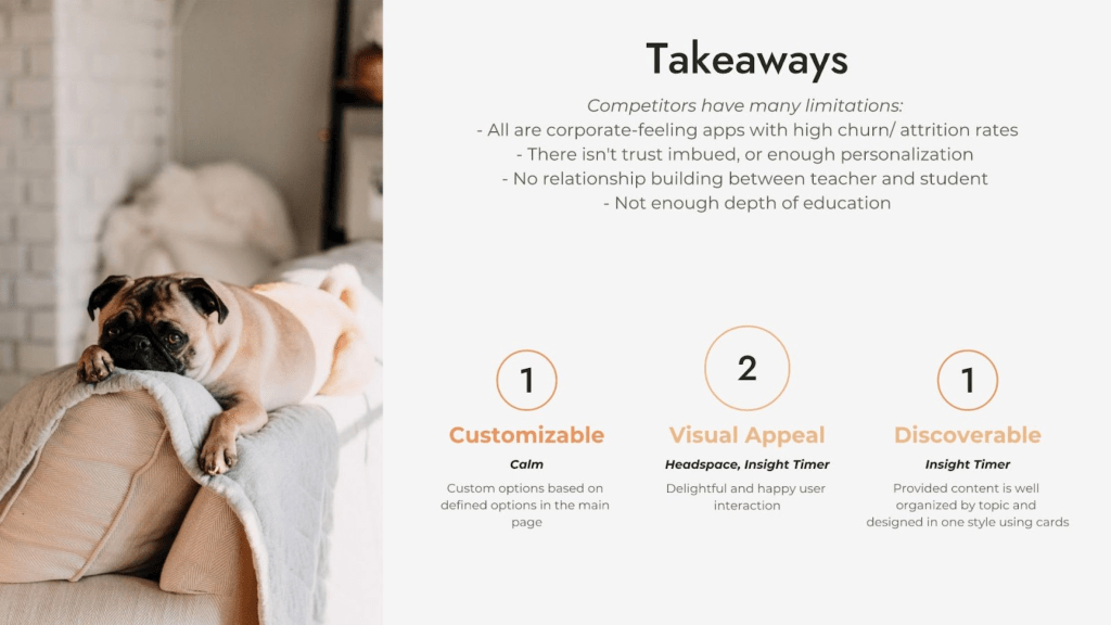
Calm and Headspace allow users to choose their preferred style of meditation practices; Insight Timer works with meditation and yoga teachers, who livestream or upload teachings to students.
They are all apps, all impersonal, without any deep connection to a teacher, and with high attrition rates. They lack a personal connection and bond to a teacher, don’t offer community for students, and can’t address timely real world issues that cause stress for students.
They can’t adjust for changing needs of individual students. One cannot connect with and learn from an app, in the same ways as person-to-person interactions provide. There is no substitute for “in real life”.
See full competitive set and competitive analysis.
Comparative Analysis
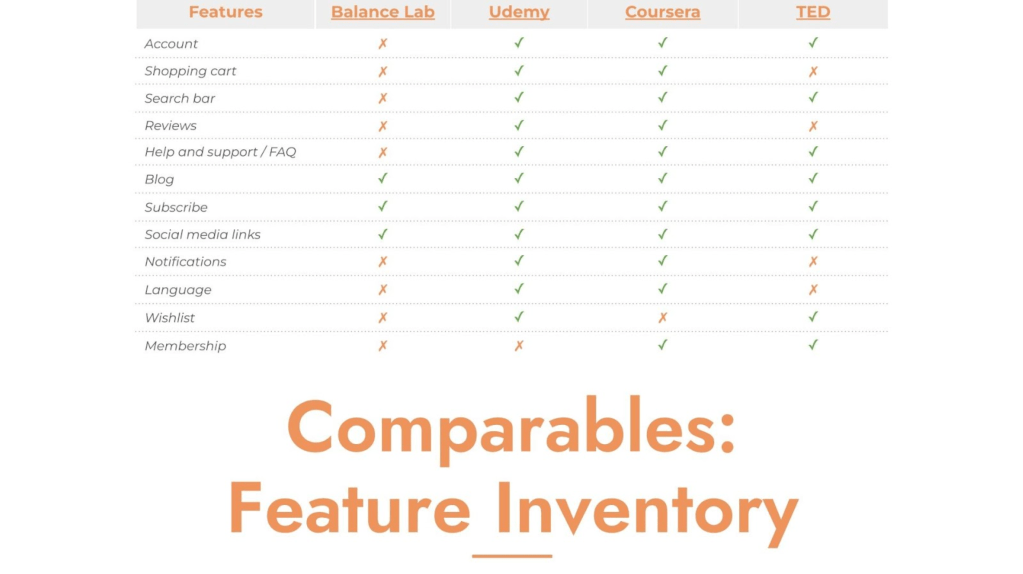
We examined websites that offer educational online programs, as this is a similar business service to Balance Lab. (Udemy and Coursera are EdTech companies.) We looked at features aiding navigation, and those that aid content understanding.
This enabled us to hone in on how Balance Lab’s site could best be improved: By adding an account creation feature, ecommerce capability, ratings and reviews, and membership and FAQ pages.
USER INTERVIEWS
To fully understand the needs, desires and preferences of people who meditate, we spoke with Balance Lab students about their experiences, and with people who use apps or other online tools to guide their mindful meditations. Based on our interviews, we developed our top takeaways from people’s preferences, which kept our design decisions grounded in our research insights.
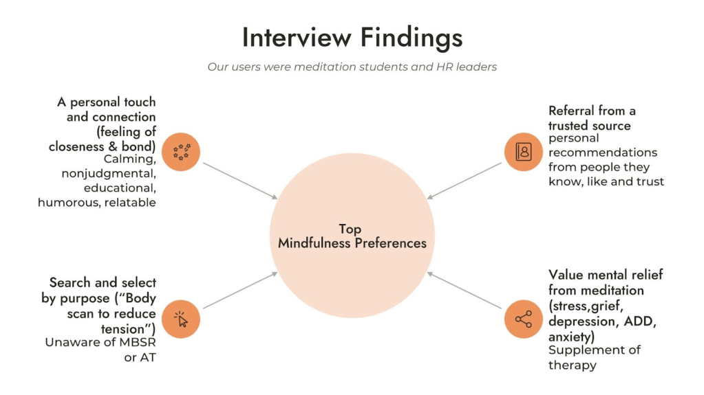
We found common outcomes:
- A personal touch and a feeling of intimacy is important. People wanted guidance, structure and direction, yet didn’t want to feel judged.
- Referrals from trusted known sources were very valuable.
- People meditated for specific purposes: They needed relief from common physical and mental health complaints.
- People looked to meditation as a complement and supplement to therapy.
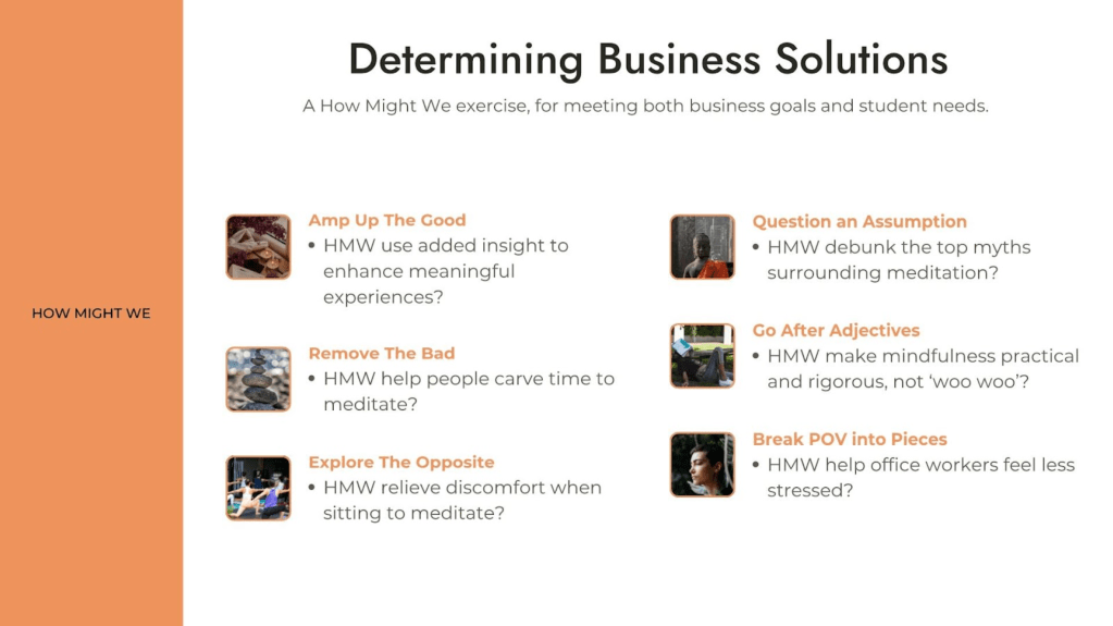
The Problem and The Solution.
Part of why I love UX Design is how much analytical rigor and critical thinking it entails. The process always challenges you to think deeper, throwing out first draft ideas and anything you cannot adequately lobby for, based on research. It somewhat forces you to gain eloquence and debate prowess:
If you want your ideas to have staying power, you better be prepared to advocate hard for them, and show how they’ll best serve your client and your audience.
We sorted our best ideas for growth by category and theme, and then began working through iterations and implementation. Working as a team of three designers was awesome: We accomplished much more together, than we each could have individually.

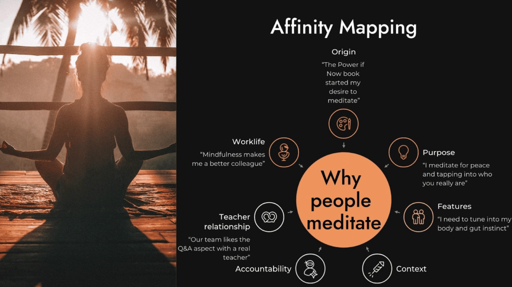
Finding relationships
My affinity map’s quotes support each theme. Every key finding was linked to a design feature.
DESIGN STUDIO.
SKETCHES
The most challenging part of this project was determining how to best synthesize our research findings into actionable solutions. We wanted to provide our client ways to grow his business that are viable, feasible and desirable.
After a few standup meetings for regrouping, we sketched possible solutions. We focused on each audience (we had 3 personas, representing different user bases), and generated ideas that fit the ideal ways people wanted to incorporate mindfulness into their lives.
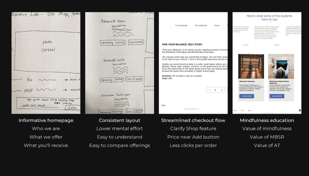
WIREFRAMING IN FIGMA
When we finally were ready to wireframe our new website, we took care to look back at our feature inventory, plus/delta comparable analysis, task analyses and knowledge of UI principles.
At this point, you may be pretty tired, thus tempted to expedite wireframing rather than build out crucial components. Resist this: It’s imperative to maintain perspective in order to successfully implement everything. The moment you present your initial designs, it becomes clear the effort is well worth it.

Links to our wireframes and mockups are here.
PROTOTYPING AND TESTING
We sampled the best ideas from our sketches and consolidated them, to ensure our prototypes captured the range of features our users wanted.
Creating an ideal user flow and 3 iterations of site maps kept us focused on the user experience we were designing. Even as we created our website in Wix, we worked through the eyes of one of our personas and thought back to the user journey map we made.
This all allowed us make quick decisions while prototyping, and provided a script for our presentation to our client.
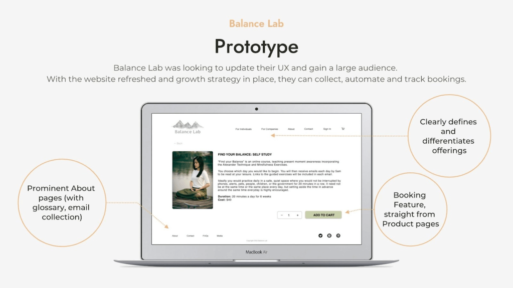
We created a high-fidelity clickable prototype for first round usability testing, with three testers. The prototype tested user interaction, understanding, flow, navigation and ability to complete tasks.
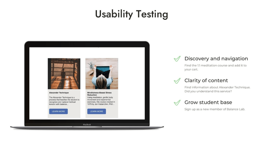
The tests revealed we had more work cut out for us. We summarized our findings in Notion, and got started on refining and polishing our second round prototype.
NEXT STEPS.
Our website design improved ease of understanding, and highlighted the uniqueness of Balance Lab. It answers these questions:
Who is our client? What does he offer? What value do his offerings hold? How do they stand out?
We streamlined the user flow (users were able to complete tasks faster), with an updated UI and clearer UX writing. We also researched, outlined and presented growth opportunities for Balance Lab.
Our next steps are a third round of usability testing, validating product market fit, and employing growth opportunities by building out content, with partnerships and digital media.
Reflection
This sprint cycle was invaluable in fine tuning my skills as Project Manager and point of contact. My success depended on the success of others, and I loved how much solidarity and togetherness that entailed. Our group experienced many roadblocks outside of the scope of our project — illness, unexpected travel, an initial launch faltering, factors out of our control — and we each recovered gracefully and resiliently. That perhaps is what I am most proud of from this project, that we summoned the perseverance and self-possession to surmount a bunch of obstacles.
I observed that our ability to recoup inspired pride and respect from others, and I’m incredibly proud of my team. We banded together and kept our attitudes and morale super high, through a very strong finish.
As the Research Lead, the extensive background research I conducted helped me emphasize with my client, to better understand where he was coming from and what he needed. By the end of our 8 detailed interviews, I saw my partner and I develop better interviewing skills and practices, which was highly motivating and satisfying.
I’m well aware that the commercialization of “wellness” and bringing ancient mindfulness practices to the west is problematic in many ways. I chose to keep above that fray, in order to stay focused and to prioritize the needs of my client, a learned, compassionate man whom I greatly respect, and to our users (the students).
Hearing our audiences’ needs and struggles — and how open and vulnerable they were to us as design researchers — strengthened my conviction that raising awareness of meditation and mindfulness techniques is a net positive for our society. It’s simply safeguarding our mental and physical health, and that does not need to be politicized. There’s a lot we can do for each other, to lighten each other’s burdens and encourage protection of our collective health. In this project, alongside General Assembly and Balance Lab, that was our biggest goal.
Connect
Follow me on Twitter, LinkedIn and Medium for my latest blog posts and exclusive content. Email me to chat about sustainable design or to say hi!
